Contrast & Curves
It’s time to get your contrast under control with tone curves.
A large part of photography is judging the various tones that make up an image and deciding where they should be placed in the final presentation of the print. Both in the image display of our cameras and in Adobe Lightroom, we see this tonal distribution visually represented in the histogram. The simple name for this tonal distribution is “contrast” and as photographers, we are constantly trying to control it. Reading the histogram and controlling the placement of tones within the image is one of the most important skills a photographer can master.
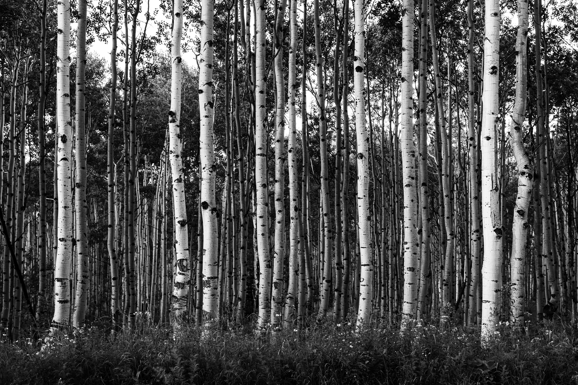
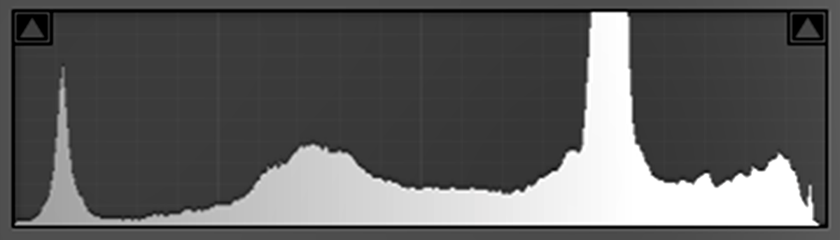
We actively adjust image contrast both when we shoot and in post processing. When we shoot, we do this by judging and manipulating the quantity, quality and direction of light. A softer, more diffuse, less directional light creates less contrast. Conversely, harder, more directional light creates brighter highlights and leaves darker shadows which equals more contrast. This is then shown to use on the camera and in Lightroom by way of the histogram. I constantly hear people say that a good exposure is described on the histogram when there is an even distribution of tones all the way across the graph (like in the image below), and while this statement is true for the image above and the histogram below, the advice is actually very poor advice. In reality, a good exposure on the histogram looks like the image it is describing.
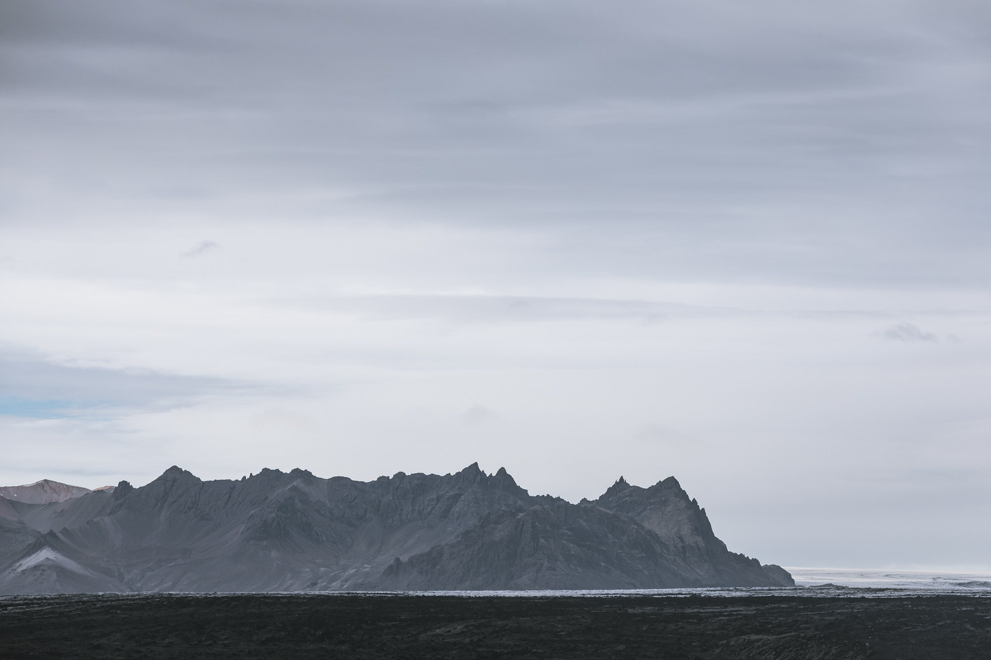
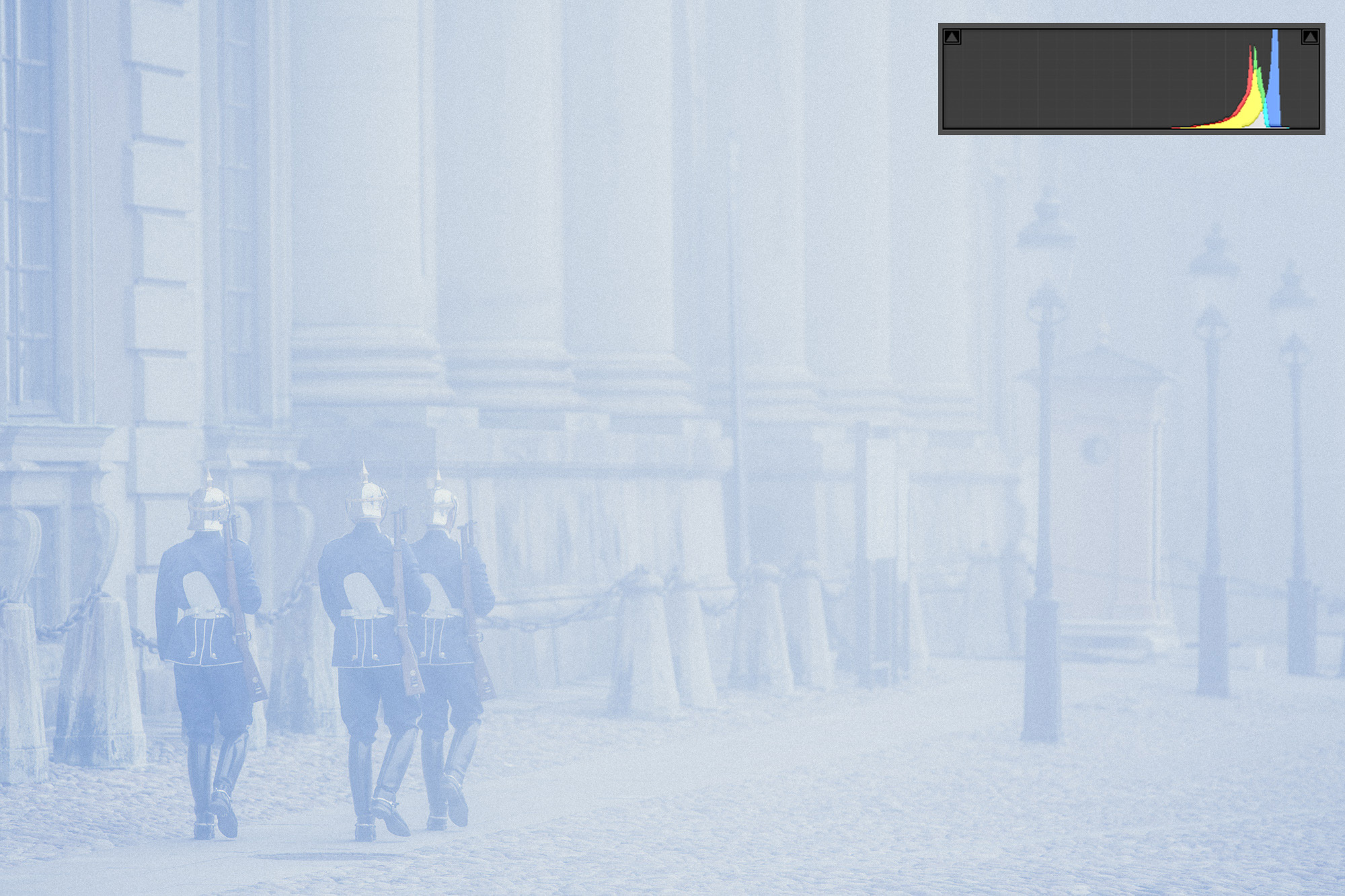
On a grand scale, fog is the prefect light modifier for reducing contrast. If only we could command the elements and bring it in whenever we needed it. Fog has the effect of bouncing light everywhere and filling in all the shadows, thus everything becomes almost equal in value. No real shadows and no real highlights. We very rarely need this intense effect, but we do use soft boxes and fill reflectors all the time to help fill in the shadows and even out the difference between the shadows and the highlights. Pay attention to the histogram describing this image. When your photograph has no shadows, the histogram should display nothing on the left side of the graph. A proper exposure will avoid allowing the data to clip on the left (shadows) or the right (highlights) of the histogram, but the graph in between the either edge should be an accurate description of the tones you are seeing in the scene.
In photography, the further apart the shadows and the highlights are on the histogram, the higher the contrast will be in the image. In life, we create contrast by making friends with strange people, or having peculiar pets. The more peculiar and different the greater the contrast. I had two dogs growing up, one was a tiny little Cockapoo, the other was a big Golden Lab, who was also the fattest dog in Norther Arizona (he has an award to prove it)! Just watching them run down the road together was entertaining. As with Shroder and Uggums (my dogs), the further apart we are in looks or temperament from our companions, the more drastic the contrast will be in our lives, which results in more drama. This is not to say contrast and drama make the best images. Low contrast images, like the image above, create a sense of quiet which has equal value.
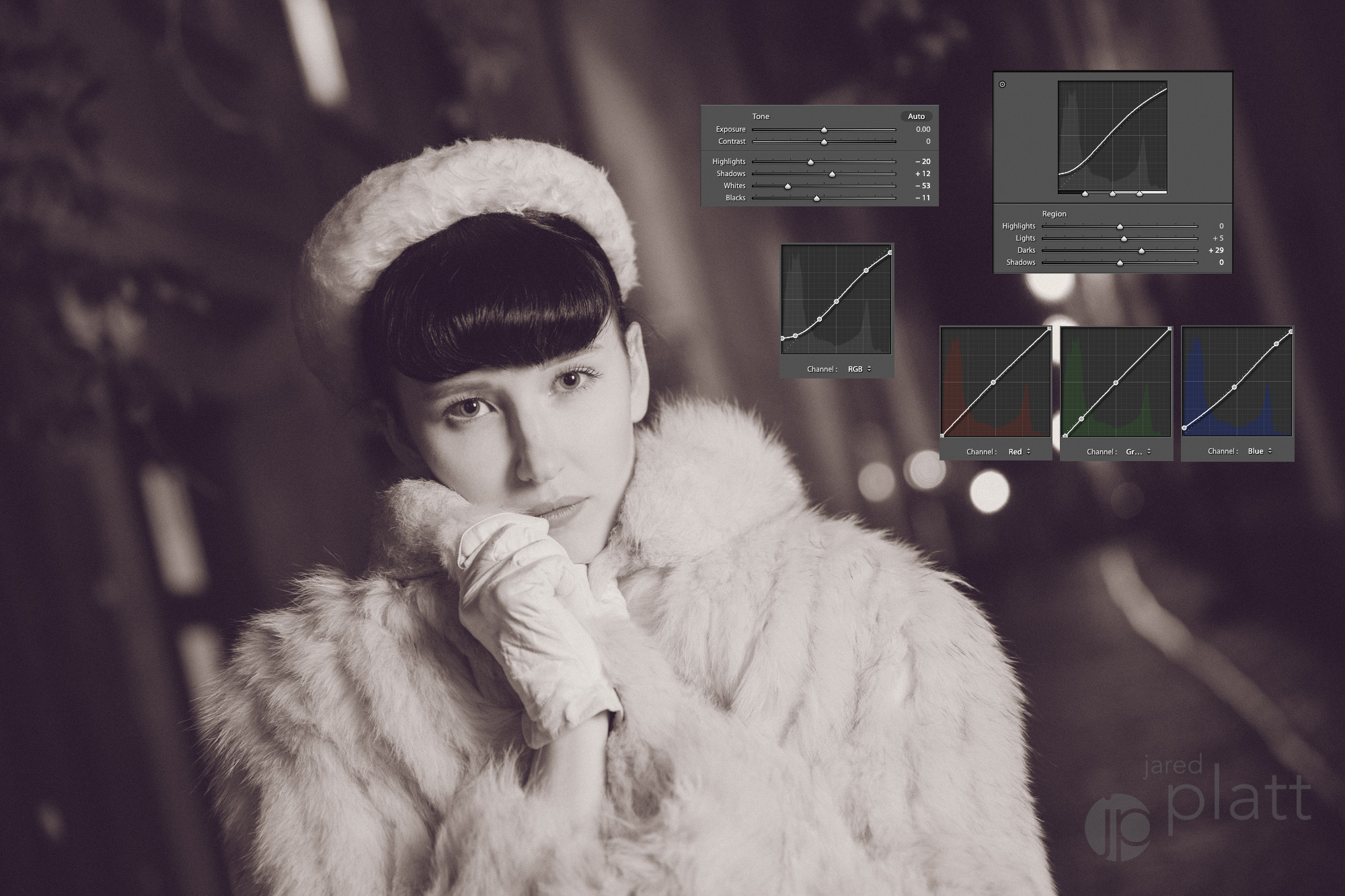
In the end, our choices in image contrast change the feeling our images produce. Because of this, post-production really matters and contrast is a critical portion of that. We use the contrast slider and the tone curve to make these final contrast adjustments. The contrast slider is the simple way to change the contrast in an image, but it is also the least subtle. It is like using an axe to cut your sandwich. You will definitely cut the sandwich in two, but you will also cut the plate and most likely the table as well. If you want to maximize your control over the contrast in your image you need to master the use of the Tone Curve panel. Take a look at the image below and notice that the contrast slider is left at zero. The major contrast work is achieved in the tone curves area of Lightroom, both in the Parametric and the Point Curve areas of the Tone Curves Panel. You can see that there are five different curves at work in this one image. The lower contrast in the image helps to soften the model’s already soft look. When you are creating a tone curve for the first time, keep in mind that you should only really need to do this once. If you like the effect you have created, make a preset for that tone curve to make it simple and efficient to apply your complicated curve in the future.
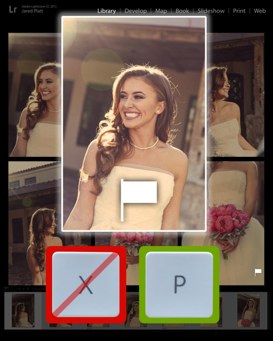
I have created a short video on Using the Tone Curve Panel in Lightroom to get you started into exploring this powerful tool in Lightroom. After watching the video, I encourage you to spend some time playing with your images in Lightroom using the Tone Curve pane in the Develop Module, and to get you started, make sure you download the free Tone Curve based presets I have created for you.
Using Tone Curves in Adobe Lightroom
Which tones you emphasize or de-emphasize can vary widely depending on the mood you want to create and where we want the viewer to focus. I may use dramatic lighting or soft lighting depending on the story I am telling — bright and happy, or dark and moody. However I light my subject, or set my exposure at the camera, I have only told half the story. The other half of the story is told when I open the image in Adobe Lightroom and make adjustments to the image. That is, as Ansel Adams said, the performance of the score (the capture being the musical score). We captured the sequence of the notes in our camera, but the way we play them out in post-processing provides infinite possibilities for performance. Mastering all of your tools (or instruments) is the first step to gaining complete control over your photographic voice.
Post Script: The contrast control in the tone curves panel is not only the superior place to tweak your contrast, but it is also a better place to create split tones and even cross processing effects. The power in the tone curve is quite intense. For this reason I use the tone curve in a lot of my Lightroom Presets. Let me get you started by giving you a small set of three great Classic Black and White Lightroom Presets that use the tone curve as the basis for their effect.

Are you a high contrast or low contrast shooter? Do you like big drama, or subtle dreamy tones? How do you achieve your signature look with contrast? I’d love to hear from you.