(First Published on the Pictage Blog, Thursday, Feb 11, 2010.)
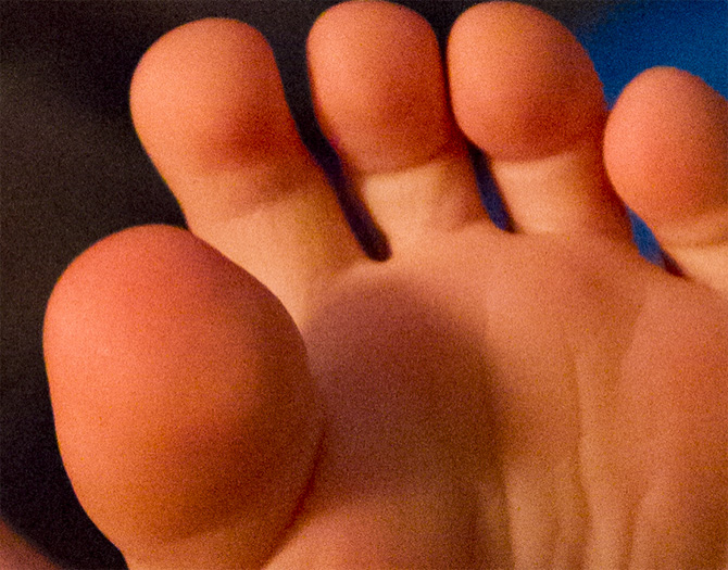
So I have a little game I first played with Elizabeth Pratt from Canon. The game is called “Guess that ISO”. We are going to play it here today. for those of you who are not professional photographers, ISO is the sensitivity rating of the film or chip in the camera. Lower ISOs are best in bright lighting conditions and higher ISOs allow for proper exposure in low light situations.
Here is the image we are going to work with. It was shot with a Canon 1D Mark IV. This is the final image with various adjustments and increased noise reduction etc. I just wanted you to get a feel for the image we are working with.

The Fine Print:
The zoomed in detail images below have only one adjustment applied. I have to be upfront here, I am not going to show you the original image with no noise reduction because that is not practical, no image is used without a default noise reduction. So, what I am showing you below is the image with absolute “normal” noise reduction in Adobe Lightroom. I have the NR set at 25, witch is the default for Lightroom for basically every camera on the market.
With the fine print out of the way, let’s play.
GUESS THAT ISO…
Look at the grain structure and noise levels and tell me what ISO did I use?
Now for a little lesson on color noise and grain.
In the beginning, was film. Film is made up of millions and millions of floating silver halides (little flex of “want-to-be silvers). These silver halides float in a gelatin emulsion (like jello but harder – made mostly of cow hooves etc…). So, no film image is ever a continuous tone. Even the best film image has a grain structure to it. The image is made up of tiny little randomized dots that, when seen from a distance create the illusion of an image. George Seurat made paintings in this manner, which is known as pointillism. His paintings were constructed from random specks of paint placed in proximity to each other. Colors were mixed, not by blending pigment, rather, several dots of yellow and blue were mixed by the eye to create the illusion of green. As the dots got closer together, the tones became more dense and vice versa as they grew further apart. The further back you stand from a Seurat painting the better and more continuous the tones and colors in the painting appear. If you have ever seen a color newspaper or magazine up close, you have seen a very large and pattern based version of pointillism. Photographic grain (color and black and white) exhibits with the same principles.
Film’s inherent grain structure was a necessary part of the photographic image making from the the 19th through the 20th centuries. We accepted it and grew to love it, because it was the only option available. Slower films, which required brighter light, had less grain and more continuous tones; faster films, which could be shot in lower light situations had more grain and created a more pointillistic effect. We came to see grain as part of the art form. Larger, more prominent grain structures felt gritty and press like. They insinuated “documentary” and “reality”, while tighter, smother grain structures presented a cleaner, cleaner view of the world, so we saw them as more controlled. Landscape photographers and commercial photographers shot this way, so naturally the images were typically more perfect and therefore a little less believable than the gritty “documentary” style images with all that grain.
Originally, photographic emulsions were mixed in only one variety: the grainy, gritty kind. But, with the advancement of the science and the introduction of finer grain structures and faster emulsions, photographers began choosing film speeds, not just to deal with different lighting conditions, but also to create a different mood or feeling in their images. Selecting a 1600 ISO press film for a commercial fashion shoot was a choice specifically made by the photographer to suggest reality, documentary or art! Films were chosen based on their color bias and for their grain structures. Some photographers loved large grain, others loved fine grain. But grain was always a part of the photographic life and we all accepted its existence and learned to manipulate it to our advantage.
With the advent of digital photography as a viable photographic medium, photographers no longer had to accept grain. Unlike film, digital captures are made up of a grid of pixels, and those pixels are so close together that from one point of color or tone to the next there are no gaps. This means it is a truly continuous tone. Digital presented us with a grain-less option that was so clean and so flawless that the visual language began to change. Photographers expected more out or their image making tools and started seeing grain as a flaw in the image as opposed to a beautiful part of it and, to some degree, some clients have rejected that gain as well. Seurat would be agog at our negative reaction to grain in a continuous tone digital age. He went through great pains to create paintings completely out of this grain-like effect and here we come in 1010 thinking that grain is an eye sore? Strange indeed.
While it is great to know that I have the option for grain-less images, the fact still exists, that grain has a purpose in image making and when used well, enhances the photograph. But, one thing digital has not done well, in the past, is grain.
Our love affair with the cleanliness of the digital capture, only lasted in the lower ISOs of the camera. Digital cameras had a problem of color and luminance noise in the higher ISOs. I remember shooting with a Nikon D1x and then a Canon 10D. Both cameras were absolutely worthless at 800 ISO. Even if you could stand the blocky and offensive grain structure, the color noise was so atrocious, you could only keep the file if you were willing to turn it to black and white. Even just 3 years ago, when comparing film to digital, one would have to admit that while the digital capture did a better job at creating a continuous tone in the lower ISOs, films were far superior to digital in the higher ISOs with its beautiful grain structures. If a digital photographer wanted beautiful grain, he would have to shoot his image in a lower ISO and then digitally manipulate the image and render the gain into the image. This is no longer the case…
Recently, camera technology and image software technology together have reduced the color noise and randomized the grain structure in the higher ISOs to the point that a side by side film and digital grain comparison at 800, 1600, 3200 ISO will leave film in the dust for continuous tone and fine grain structure. Our little guess the ISO game proves this point. In a dimly lit room, the Canon 1D Mark IV can record details, brighter than the eye can see them, at a 100th of a second and yet the grain structure is tight and beautiful. It seems that with each new generation of cameras, film looses another unique feature. Beautiful grain in the higher ISOs is the just the latest.
I have never bought into the notion that grain is a negative thing. When I shot film, I loved the grain of 400 TMAX. I loved shooting with Fuji 1600 or Ilford 3200. Now, digital has matched the beauty of those grain structures without any heroic manipulations in photoshop. Say it with me again and again, “grain is beautiful!” And now, in digital we have every option before us: heavy grain, light grain or absolutely no grain. And we don’t even have to change film!
Thanks Canon!
And the ISO is…
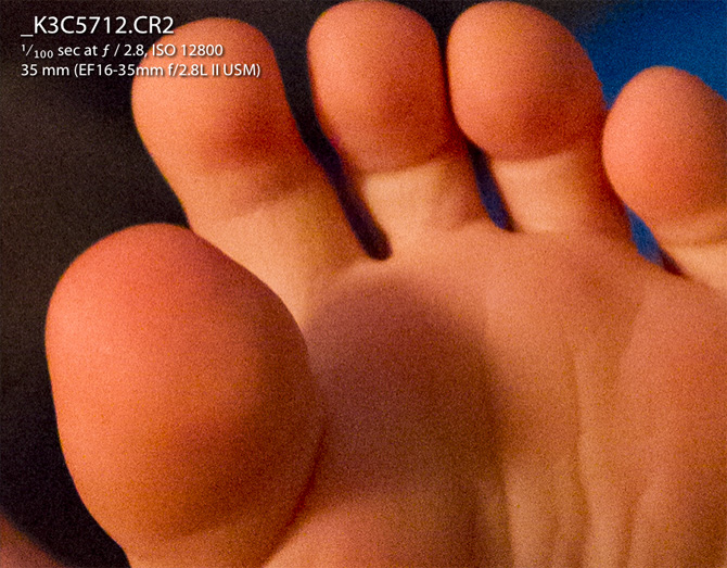
So now, are you ready to know the ISO? 12,800 ISO. I am still astounded. The Mark IV, together with Adobe Lightroom’s standard noise reduction creates a beautiful, tight grain structure with no offending color noise whatsoever. You can not beat that. It this point, every ISO from 50-12,800 is usable in digital without a second thought.
PS. Don’t get on me about Nikon v Canon, or Film v Digital. I’m not judging you if you shoot Nikon or Film. I used to shoot Nikon film cameras. To date, my favorite body I have ever shot with is a the Nikon F5. Film still has its place and still beats the pants off digital when there is no electrical outlets to charge your camera or when it comes to latitude of capture. I’m just talking about where we’ve been and how far we’ve come with respect to grain in photography. Think about it. We’ve come a long way.
Jared Platt
This article was first published on the Pictage Blog on .





[…] There is a bit of grain in them, but its manageable grain and looks cool (of course I like grain). You can’t get a better available light scenario than this, but you have to have a serious […]