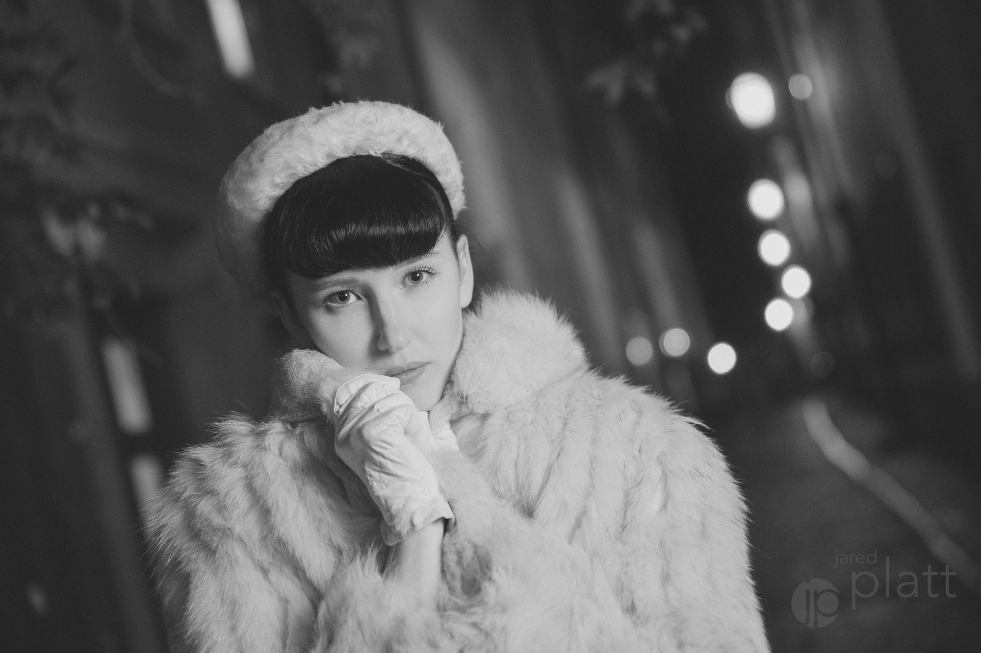
Classic Black and White Preset:
My first experience in photography, probably the moment I fell in love with it, was when my sister taught me how to develop a black and white print in the glow of the red lamps. I watched a blank piece of paper slowly drop below the developer and waited, not knowing what to expect. Suddenly, splotches of black began to grow across the face of the paper, like someone had spilled ink and it was running slowly across the face of the print. But the inky spill gave way in areas to a relief of white where the lamp of the enlarger had not exposed the paper and I began to see an image appear. Honestly, I don’t recall what the first image was that I saw printed. I am sure it was a meaningless high-school yearbook photo, but the experience is forever burned (exposed and fixed) in my memory. In honor of those experiences in the black and white darkroom, I have created three Adobe Lightroom classic black and white presets for you to enjoy. They won’t give you the magical experience I had in the darkroom, but they will give you the beautiful tones I was able to create after years of study and practice.
Of course, unlike in the darkroom, with digital images, we start with a color image. The images I am using here is the original color RAW image directly from Lightroom. What you will see in each subsequent image is a one click application of one of the three black and white lightroom.
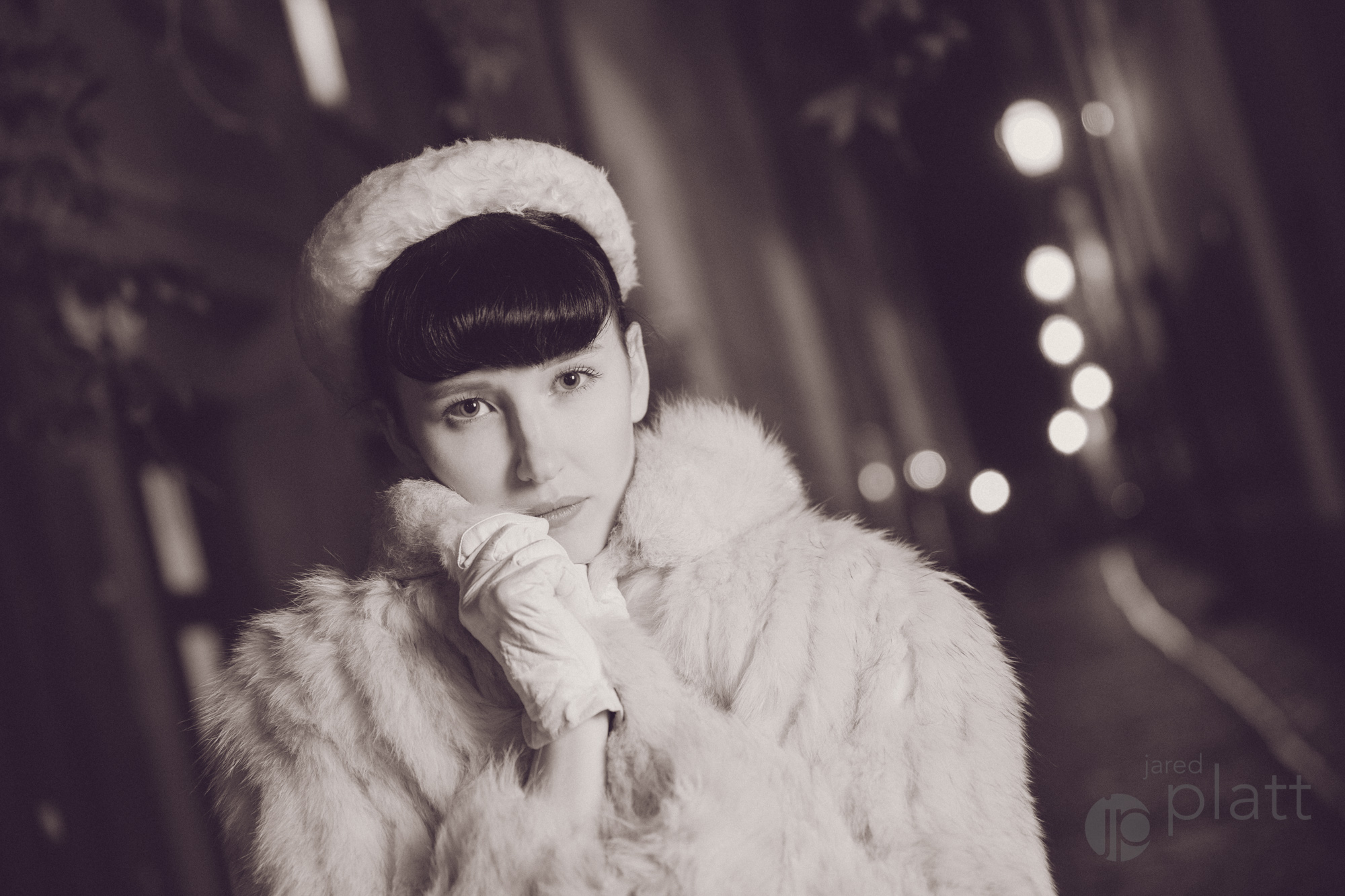
Classic Black and White Preset:
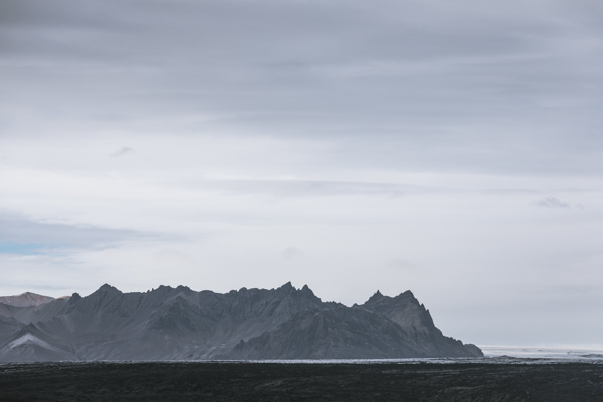
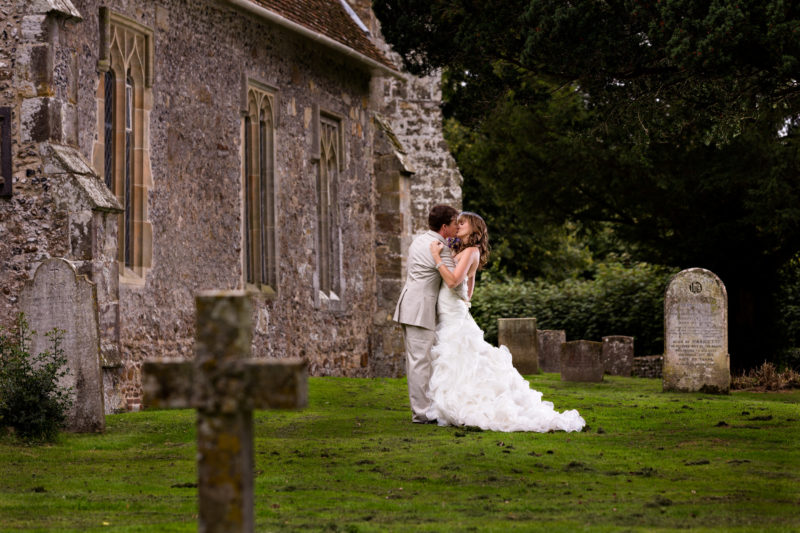
One thing that was lost in the digital world of high contrast, smooth, textureless images and poppy colors and has only been brought back by digital nostalgia, was the beauty of seeing all the zones in a black and white print on fiber paper. If you don’t know what I am talking about, Ansel Adams (I sure hope the name rings a bell) developed a method for seeing and printing identifiable zones from pure black to pure white (Zones 0-10). High contrast prints on glossy or pearl paper could never really exhibit all of those zones because they would invariably skip a zone here or there and head directly from black to light grey or white. This was something my film students would get a bad grade for doing, and now almost every photographer on the planet does daily because they are in love with the contrast knob in Lightroom and they print only to glossy or pearl papers. Well, I have created a Black and White Lightroom Preset for you that will take you back to the Classic Black and White era, and if you have a proper exposure, you will feel the the beauty of a full tonal range black and white print on beautiful fiber paper, even if you are using a pearl surface paper.
Ultra Contrast Black and White Preset:
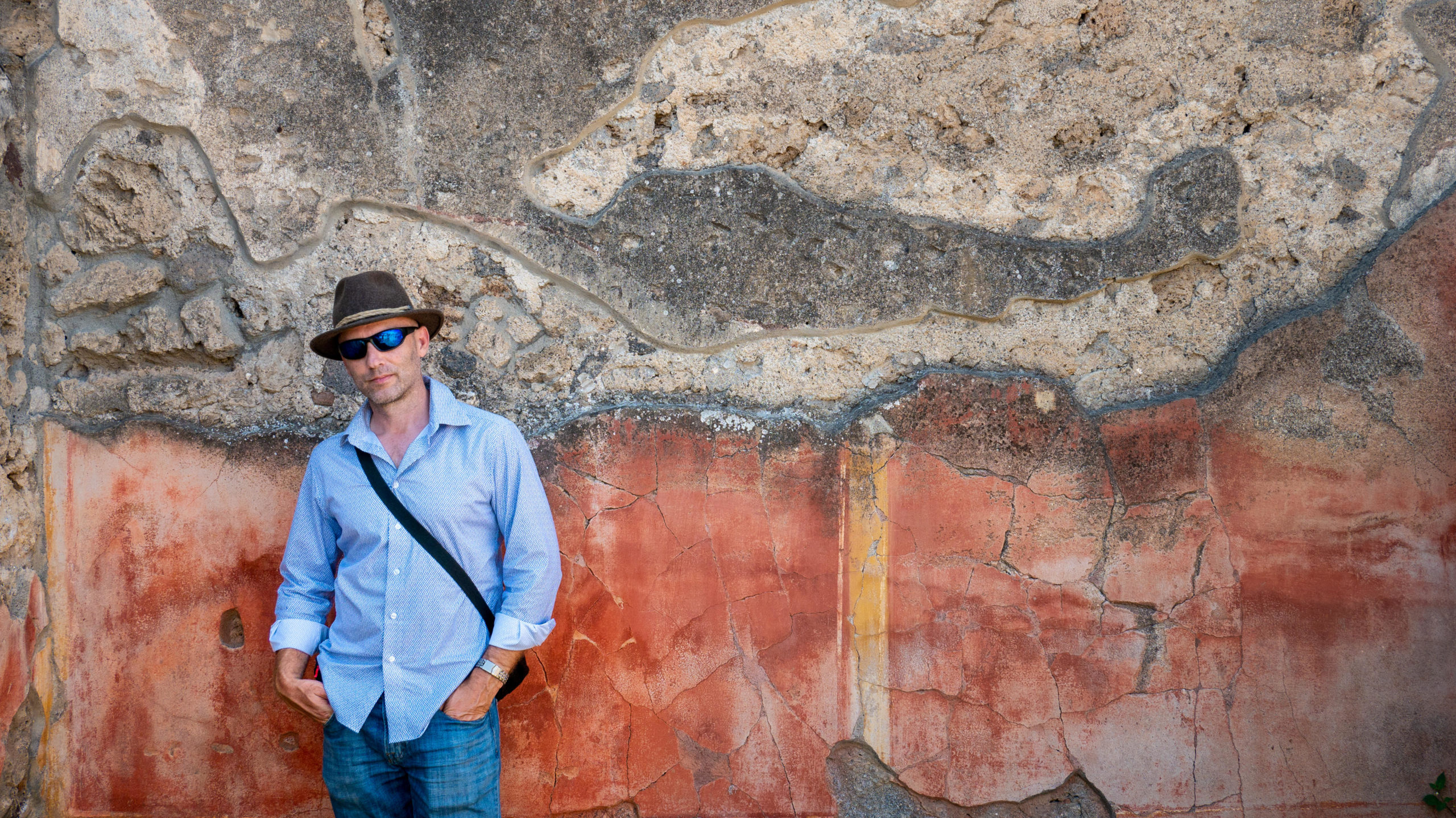
And for those of you who still want your contrast, you can get your fix with a truly high contrast black and white preset that comes from a place of subtlety and beauty rather than the brutish, blunt force of the contrast slider. That’s right, there are other places that provide much better contrast than the slider that bares the name! The tone curve is where contrast was born, the contrast knob is just a cheap imitation! Well, give it a whirl and see what you think. I’ve also added some rich and toothy grain to complete the look that you might get when you push your B&W film (which is where you would see such contrast emerging). I like to think of it as a bit of a TMAX grain. It always felt a bit like sandpaper. Very beautiful sandpaper.

Toned Black and White Preset:
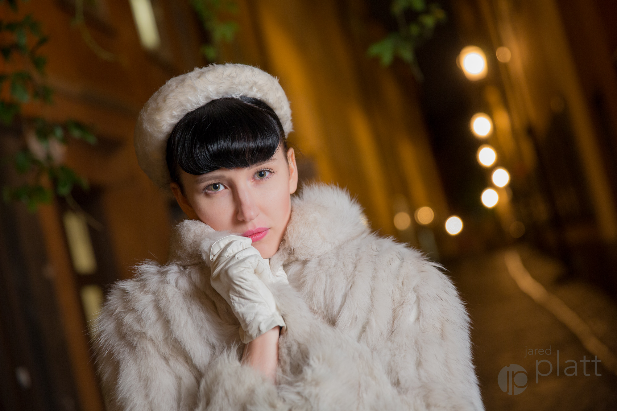
Finally a bit of warm toned black and white for those who can’t stay away from color. Now in the olden days of film, we bought warm tone paper, or cool tone paper. Or we dropped our silver prints in a bath of sepia, or selenium toner. This was very different then adding a wash of color over the top of our prints. True print toning doesn’t stain the paper, it stains the silver (the dark parts of the print), which means that the paper stays white while the shadows change colors and do so a rate somewhat proportional to the amount of silver that is congregating together to make a deeper shadow. The easiest way to accomplish a toned print in Lightroom is to add color to the shadows in the Tone Panel. But I have taken you into a deeper, more robust realm… the tone curve. Oh, yes, it seems I am in there a lot. It is a very powerful tool. Here I can change the response of each color channel to respond to the tone curve independently. This give me complete control over the colors and allows me to create subtle toners that create depth and contrast in my toned black and white prints. And I give you a taste of a warm toned preset from my upcoming collection of toned black and whites. Don’t just use it. Study it and play with it. Get to know the Tone Curve panel in Lightroom.
Learn More About Lightroom Tone Curves:
Each of these presets are heavily based in the Tone Curve pane in the Lightroom Develop module. To learn more about using the Tone Curve, make sure to watch this free video about using Lightroom’s Tone Curve pane.

[gravityform id=”13″ title=”true” description=”false” ajax=”true”]